Setting up the perfect A/B test
When you are creating a new design for a sign-up process, a newsletter, or new call-to-action buttons, often designers use their intuition to predict what the best design could be. But intuition is based on personal experiences and (cultural) bias. It might make sense to you, but that doesn’t mean it makes sense for the user. This is where an A/B test (sometimes called split-test) comes in handy.
What is A/B testing?
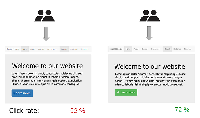
A/B testing is an experiment where you split the audience to test variations of a design to determine which one performs better. For example, if you’ve designed 2 versions of new CTA’s on a landing page and you want to see which one converts better you can set up an A/B test. 50% of your users look at version A and 50% of users look at version B. Through the A/B test, you find out which of the 2 designs converts better to determine the final design.

What do you need to set up an A/B test?
To run an A/B test you need 2 versions of a design, with changes to a single variable. This piece is important, otherwise, your data becomes inconclusive. Test a design difference in a call-to-action, or a new banner, but never more than one variable.
Split your testers into two equal-sized audiences, whether you’re testing in a research lab or live. Set the test for a specific amount of time as well. Don’t make this too short, it is often better to collect data over a longer period of time to really see the effects of your design. As a UX researcher and designer, I want to create the best possible experience for my users, but at the same time, you want to convert users for your stakeholders. For example to increase rates such as sales, sign-ups, and retention rates. There are two types of A/B tests to conduct to increase conversion rates.
A/B testing: The User Experience test vs the Design test
The user experience test is all about the user. In this test, you want to learn more about how the user experiences the design. Take the call-to-action button from earlier, in a UX test you want to learn which of the two buttons converses better. Perhaps these buttons are in the same place but have a different color or they are exactly the same but in different locations on the page. Different locations call for a UX test while a colour change is a design test.

In an A/B test you have two versions of the design ready. One could be the old design and one could be the new design. Version A, which could be the old design is called the control and Version B is called the challenger as it challenges the original design. Each version gets shown to 50% of your target audience, over time you can learn which one performs better. Hotjar is a useful tool here to gain insight into the user’s behavior.

How to conduct an A/B test?
Now it’s time to explain how to set up an A/B test and what to keep in mind. Before you can conduct an A/B test there are a few things you need to take care of.
Before the A/B test
1. Pick one variable to A/B test
As stated before, you can only pick one variable to test even though there may be multiple things you would like to test. When you decide on one independent variable your results will show the performance of that one variable. With multiple variables your results become inconclusive and the test results won’t tell you anything.
Possible things you can test, besides a CTA are other alternatives for design, copy, and layout. Think of changes in photography, illustrations, colors, wording, email subject lines, names, personalization, and placement of items.

2. Identify your testing goal
As with any test, it is important to identify your testing goal or objective. In an A/B test, we often call this the dependent variable. Sure you will see more things during a test, but with a testing goal in mind you create focus on the test and when you synthesize your results.
3. Create a control and a challenger
An A/B test works best when you are comparing two versions. I often hear people talk about A/B/C tests or multivariate tests, and though they can work, they can make it harder to define the results. In an official A/B test you have the control (often the original design) and the challenger (your new design). When these are defined your A/B test has a clear distinction in what you want to see.
4. Split your testing group equally and randomly
Important in an A/B test is to split the testing group equally and randomly. When you have 100 users per day, show 50% of those users version A and 50% of them, version B. Make sure this is randomized to not bias the results. Make sure to involve the right users in your testing process.
5. Determine your sample size
This is not needed when you are live testing different versions but when you are working in a research lab to test your design then determining the sample size is important. How many people do you need to know the results are valid? For example, if you are testing an email subject line, you’d want to send this to a significant amount of people to achieve statistically significant results. But a button could possibly be tested with 30 people in each group. Based on whether you’re testing live or not, try to gauge when your data is valid and thus how many users you need for valid results.
During the A/B Test
Now that the setup is done, let’s take a look at what you need to do during the A/B test.
6. Use a testing tool
To do an A/B test on your website or in an email it’s useful to have the right tooling. Hotjar, as mentioned earlier is a great tool for tracking user behavior and actions, but HubSpot also offers tools for testing emails, CTA’s, and landing pages.
7. Test both versions at the same time
To create valid results it is important that both versions are shown at the same time. Users are influenced by the time of day, day of the week, and even the season they’re in. This means if you show version A during the winter depression period and version B when spring is fully here you will get inconclusive results as the testers are in a different space of mind.
8. Give the A/B test enough time to produce valuable data
Testing for a day will not create good data. Run your A/B test long enough to gather enough valuable data. The length of your test depends on the amount of traffic you get. An email subject line test, to see how many users open your newsletter could be done in a week if you have perhaps 500 users. But if you’re testing a design where the monthly users are 500 then perhaps your test needs to take a month.
9. Ask for feedback from real users
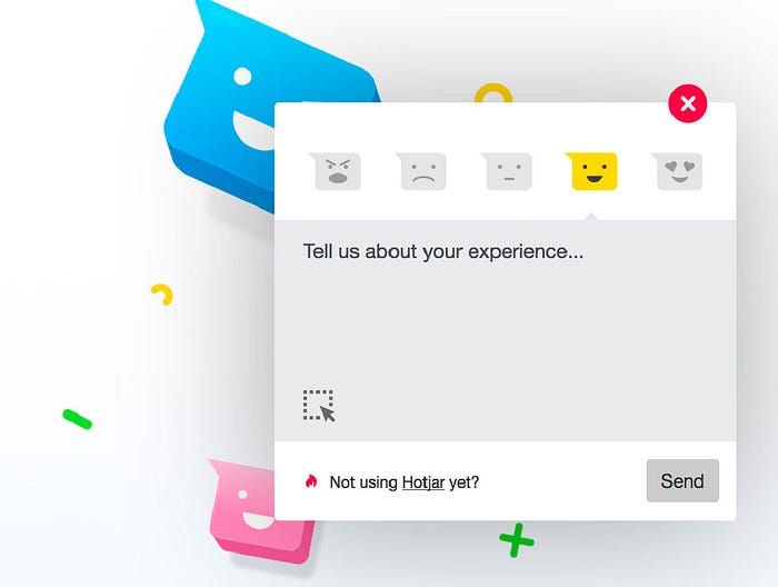
Where A/B testing often focuses on quantitative data, such as how many clicks a button gets, it doesn’t explain to you WHY users clicked. This is where feedback comes in. A quick way to get feedback from users is through a mini-survey or a poll. Hotjar can help you set these up in a simple but effective manner.

After the A/B Test
Now that the testing is done it is time to synthesize your results. Think about the following steps
10. Focus on your testing goal
It is tempting to see all the results from your test and to start analyzing all the data. But you started this test with a goal in mind. To ensure validity in your results you need to focus on this testing goal.
11. Measure the significance of the results
If you are collecting large amounts of quantitative data it will be useful to measure the significance. Measuring the significance will indicate whether or not the challenger has indeed made a significant difference for your users or not. You can do this by entering all your data in a tool such as excel and running a monte-carlo simulation or using the HubSpot testing kit.
12. Take actions based on the results
If you find out that one version is significantly better than the other you have a winner! But it can also happen that there are barely any differences between the two. If this happens, just stick with the control version and possibly run another test with a new design. Don’t forget the data you gathered as it can give you input for a new design.
Conclusion
Now you have the knowledge to set up an A/B test and see for yourself if your new design actually makes an impact. Setting up A/B testing is extremely useful when looking